LIBRARY COFFEE HOUSE
Brand Identity
03.2024
OBJECTIVE
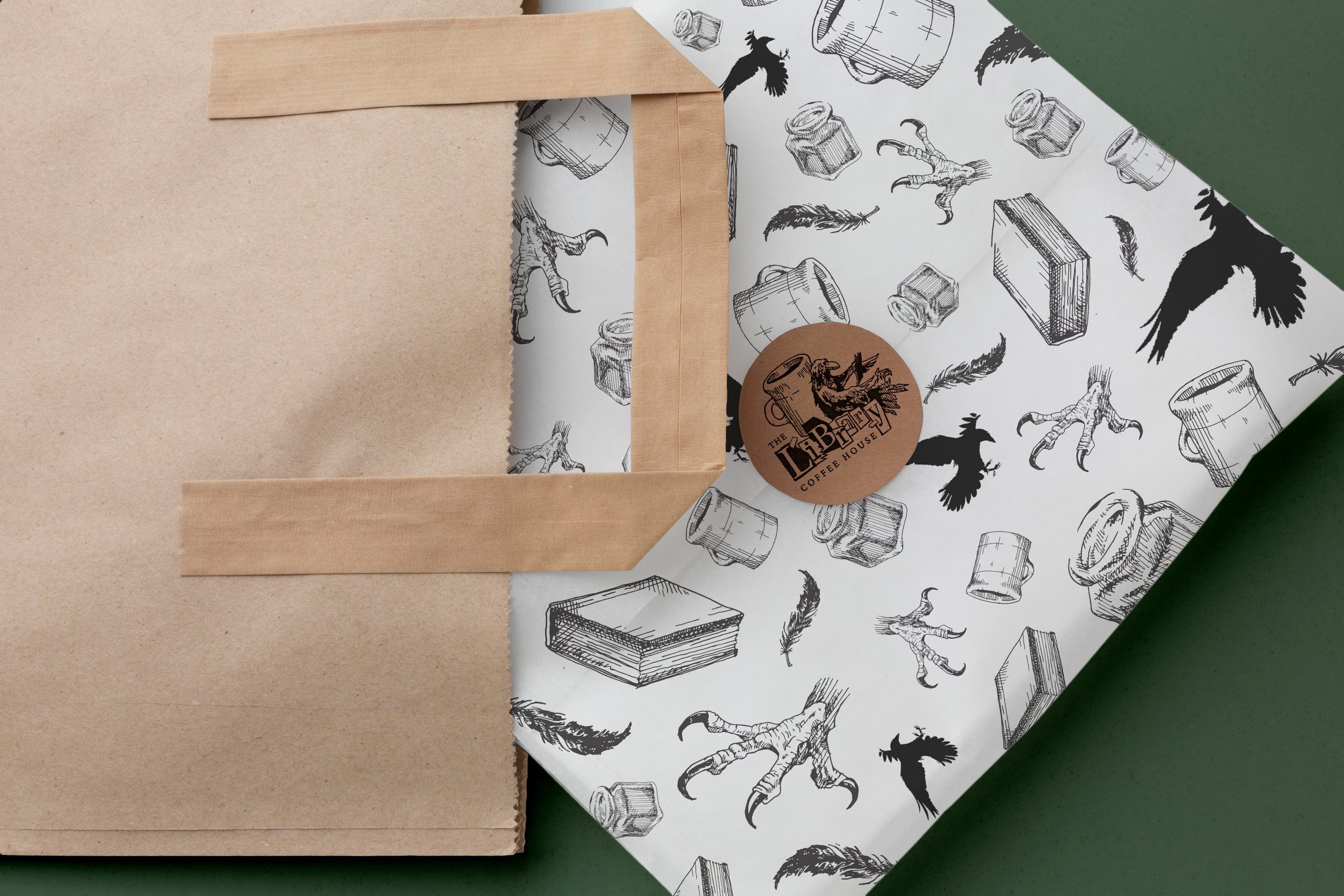
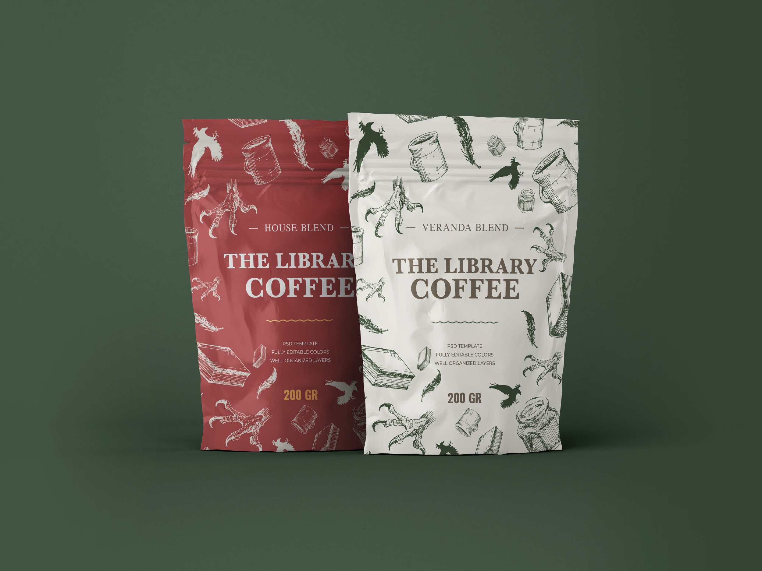
The Library Coffee House is a local coffee shop I study at often here in Long Beach. Part of their allure is their lack of a distinct identity, everything is hand written and hodgepodged together. But alas, as a designer, of course I want to optimize a brand for consumption and mass dissemination, so here is my conceptual design for this eclectic business.
I landed on the idea of a raven as a mascot for the business. Not only do they exude a mysterious air about them (as do the pretentious scholars and academics who frequent the cafe, dying for you to ask them about whatever postmodern author they’re reading), but corbins are widely known as one of the smartest bird species. Furthermore, it subtly relates to Edgar Allen’s “Raven” poem, as illustrated on the coffee truck, enforcing the literary theme of the brand.
Class Project


BRAIDING SWEETGRASS
Documentary Title Sequence
03.2024
OBJECTIVE
Class Project
This is a hypothetical title sequence for the book Braiding Sweetgrass by Robin Wall Kimmerer.
PUPAE PROJECT
Retail lines
03.2024
OBJECTIVE
pupae project. a concept piece, a curation of my illustrations created for aesthetes, nature lovers, and those who appreciate the subtleties in life.
pupae project. a concept piece, a curation of my illustrations created for aesthetes, nature lovers, and those who appreciate the subtleties in life. A ladybug champions the brand. It symbolizes how nature’s beauty comes to us, not always in broad strokes of color across the sky, but also in minute, fleeting moments.
Passion Project
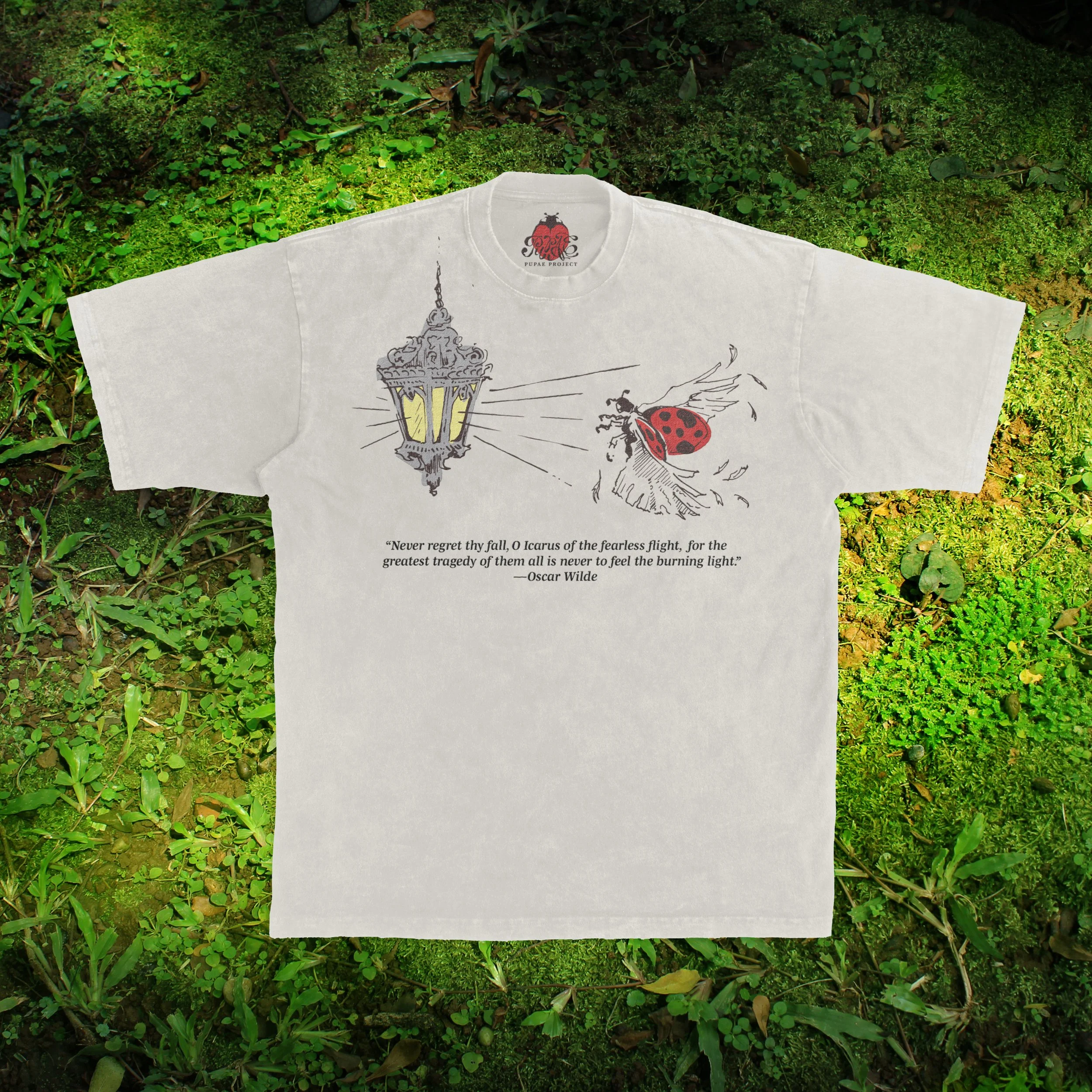
FALL OF ICHARUS
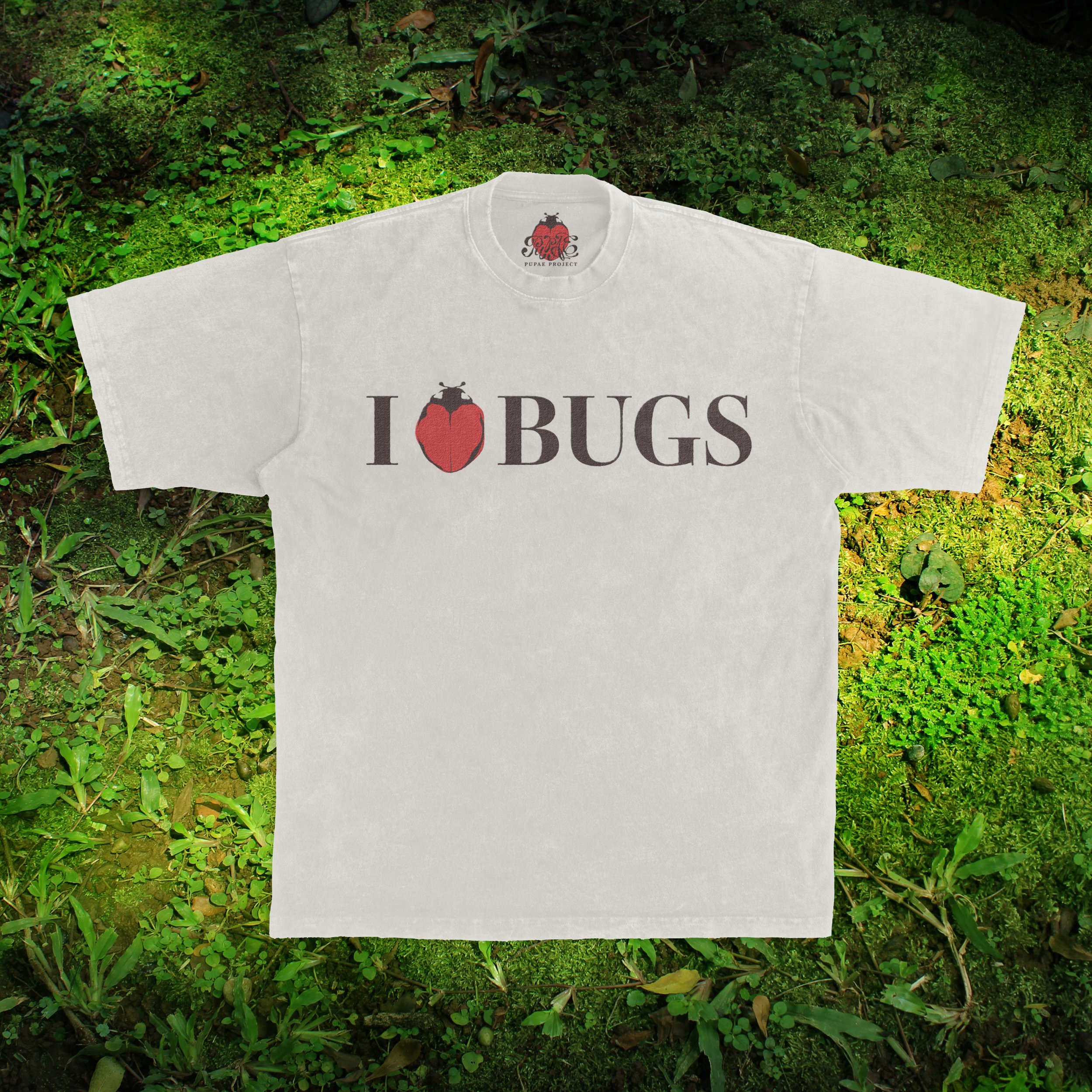
I <3 BUGS
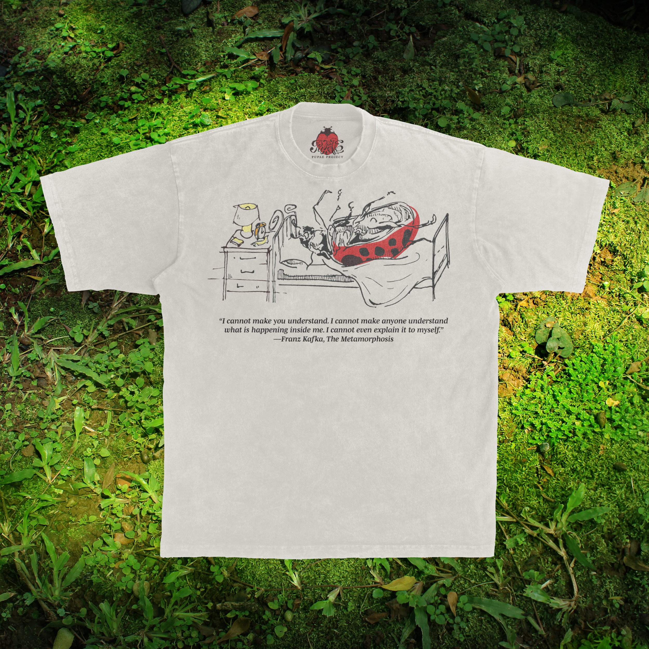
THE METAMORPHOSIS
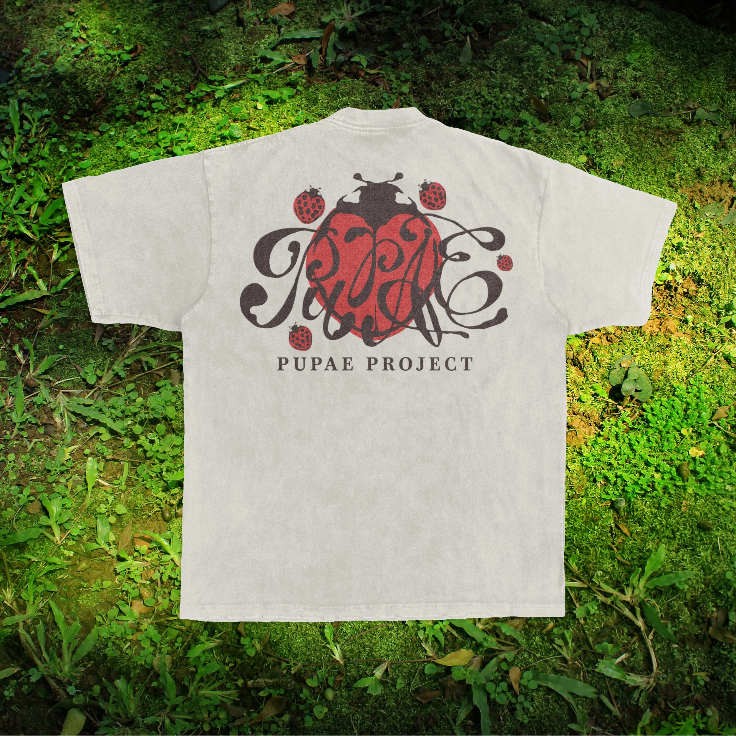
STANDARD BACK
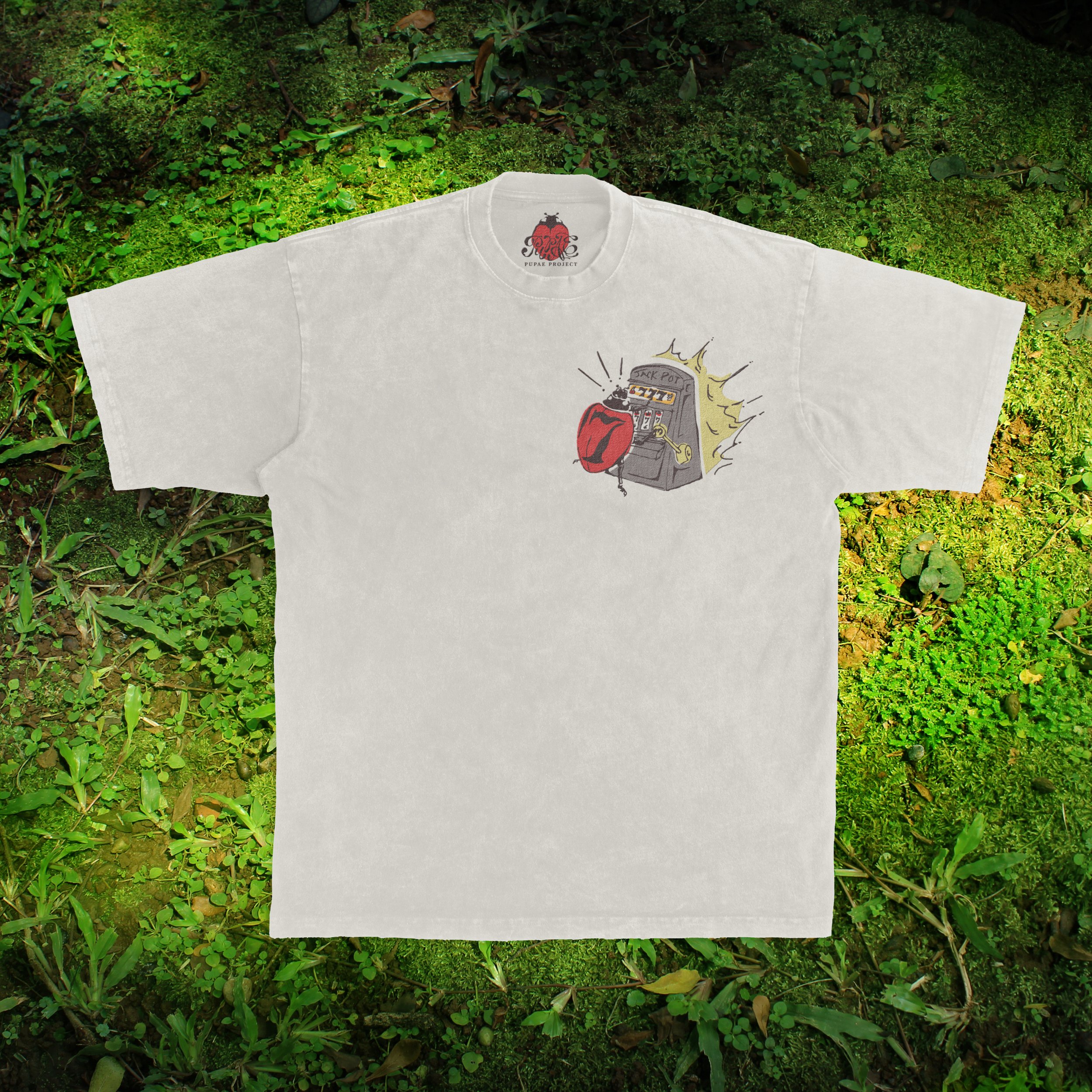
LUCKY 7
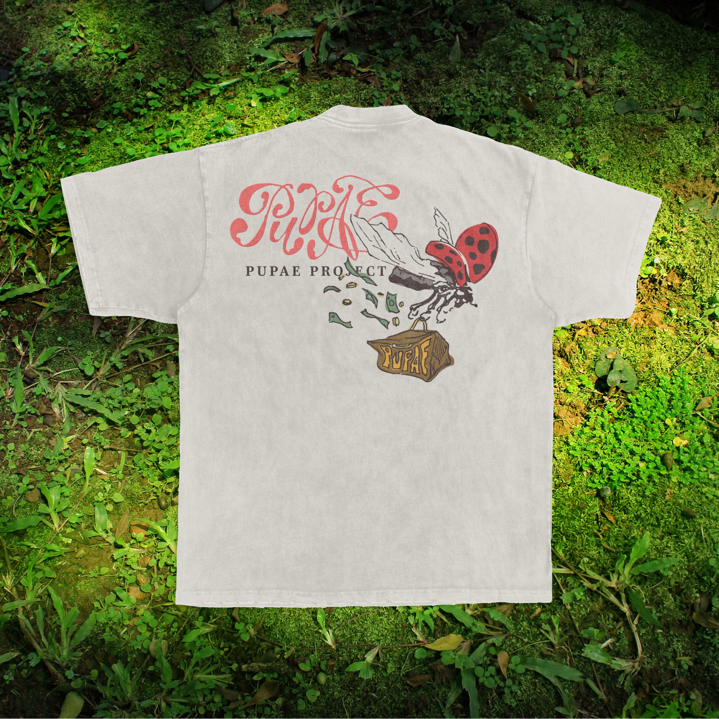
LUCKY 7 BACK
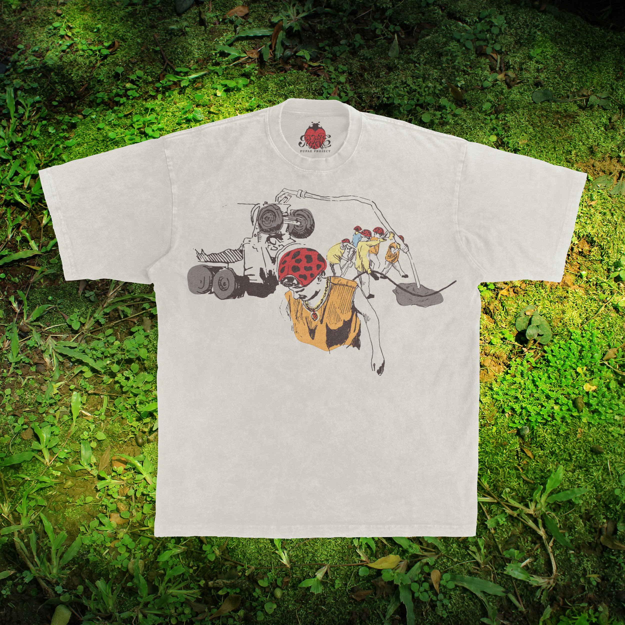
WHAT WORK IS
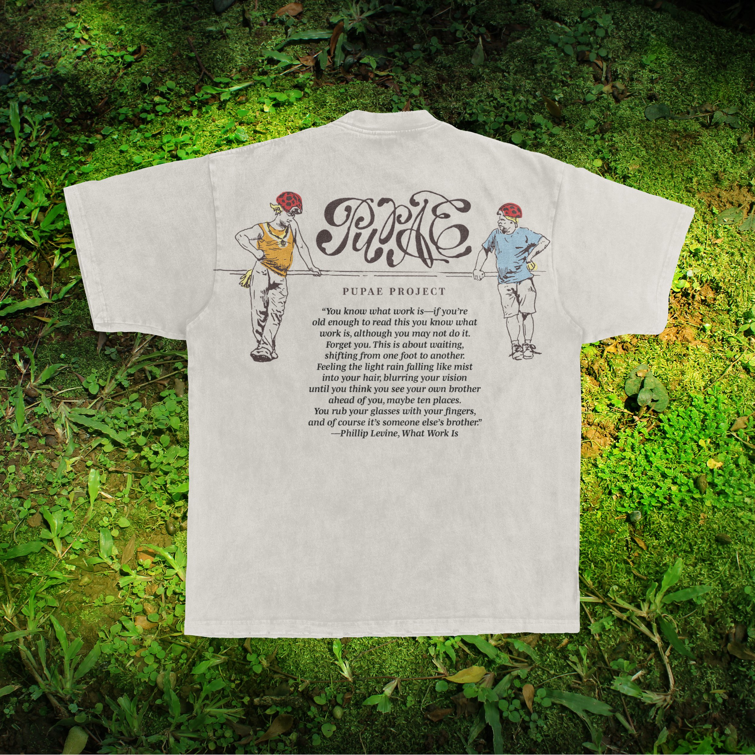
WHAT WORK IS BACK
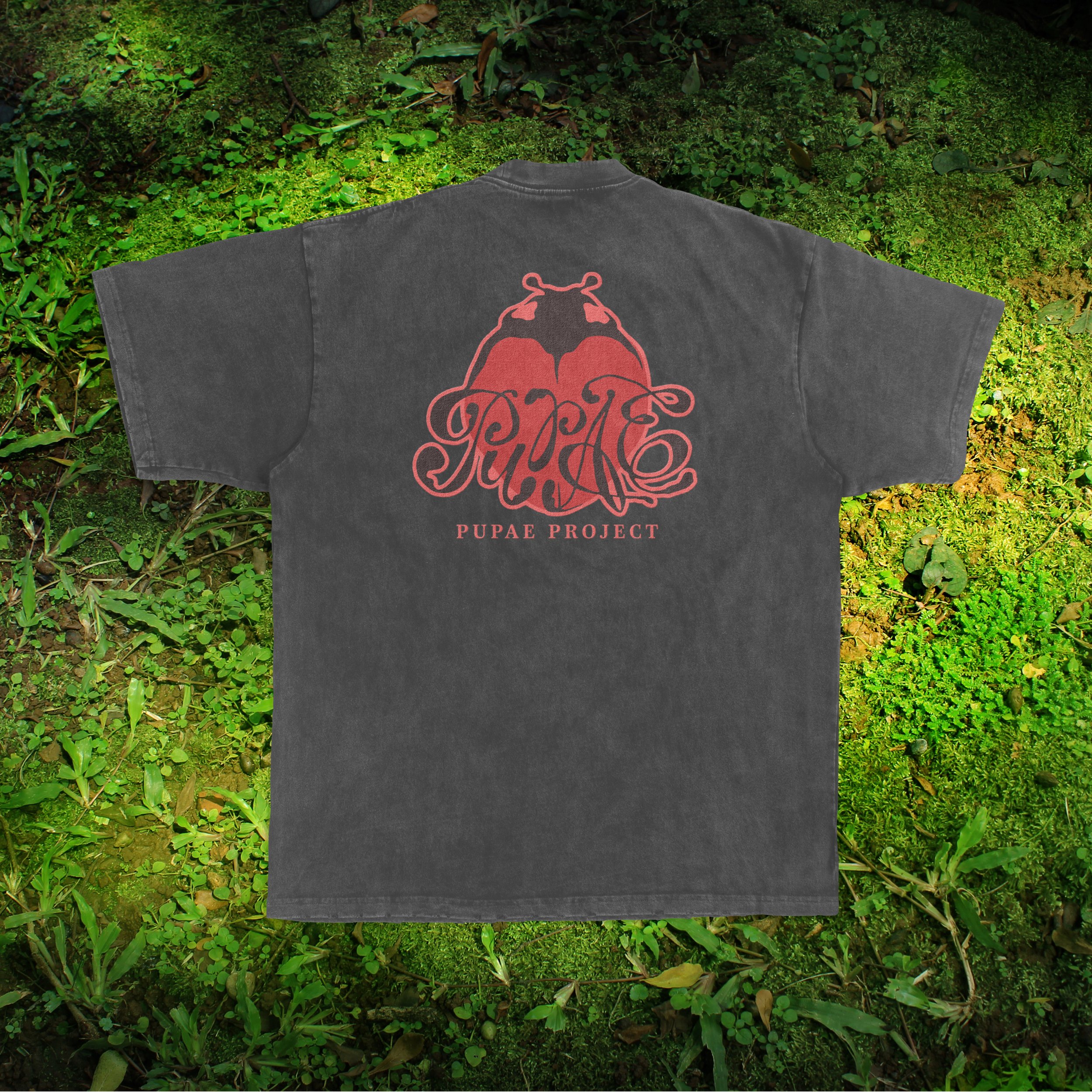
STANDARD BACK BLACK
STANDARD TAG BLACK

STICKERS
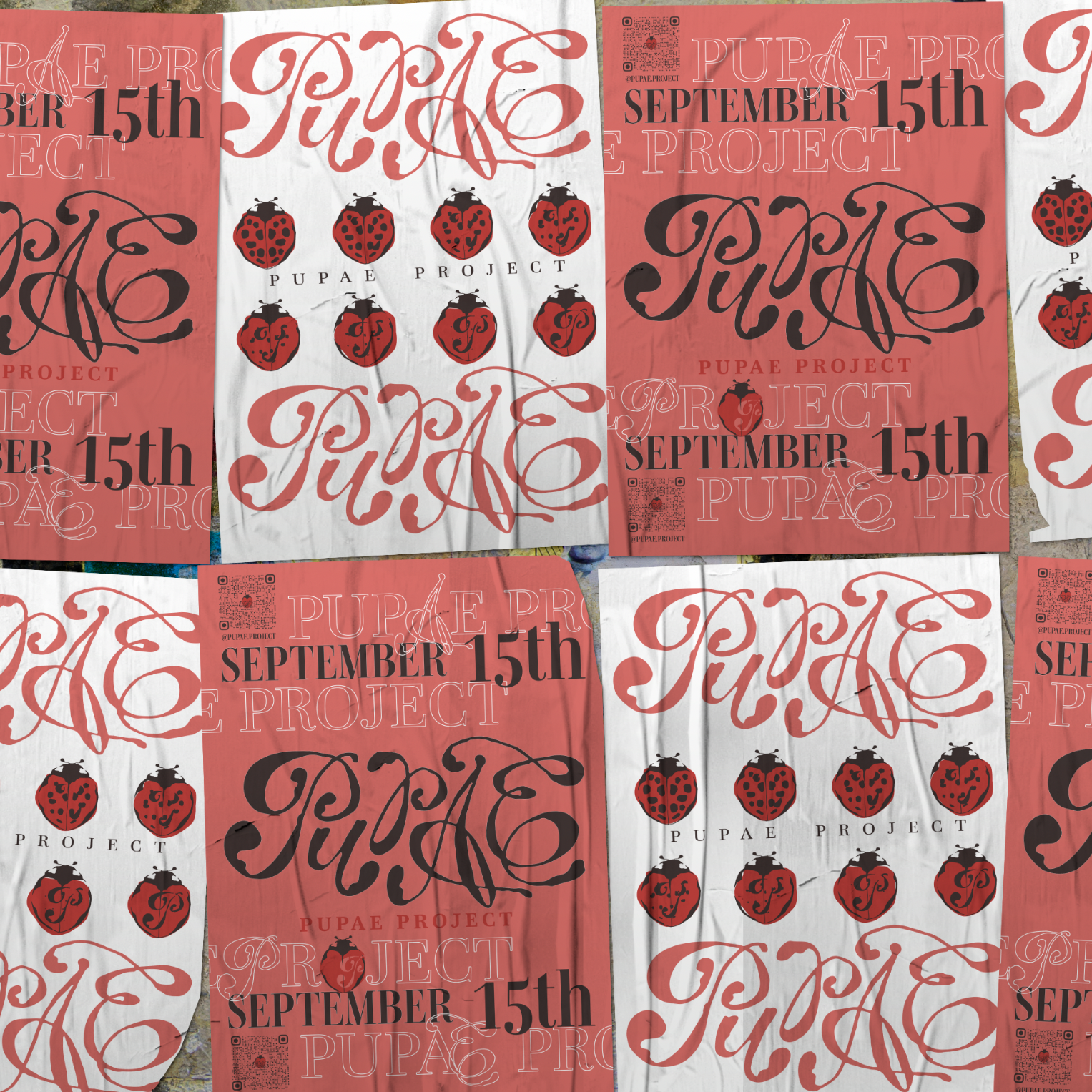
WILD POSTING

ALICE IN WONDERLAND
TYPOGRAPHY INTERVIEW
Editorial Design
03.2024
OBJECTIVE
Passion Project
This experimental interview was one of many in a typography interview book I organized and printed with my classmates. In it, I interviewed my mother, a retired third-grade teacher, and how she interacted with typography in her classroom.
The images are all photos taken of my mother teaching, which I brought into photoshop and adjusted the threshold to a semi abstract dilution of the original image, complimenting the abstract forms of the typography to its left. Other imagery I incorporated includes other classroom items, such as scissors, rulers, and staplers. Wth this imagery, I sacrificed its realistic qualities to allow an aesthetic emphasis of the form itself through repetition and image adjustment. Finally for the pull quotes on the right side of some spreads, I printed them on paper, tore it up, and photographed the loosely arranged and crumpled pieces of the quotation to provide even more texture to the page.


